Tuesday, Feb 10, 2026·Suraj PandeyUI/UXTailwind CSSDesign
Designing Dark Mode Dashboards That Don't Hurt
Admin consoles are used for hours at a time, so dark mode isn't a gimmick — it's ergonomics. Here's how I approach it in Tailwind.
Use surfaces, not pure black
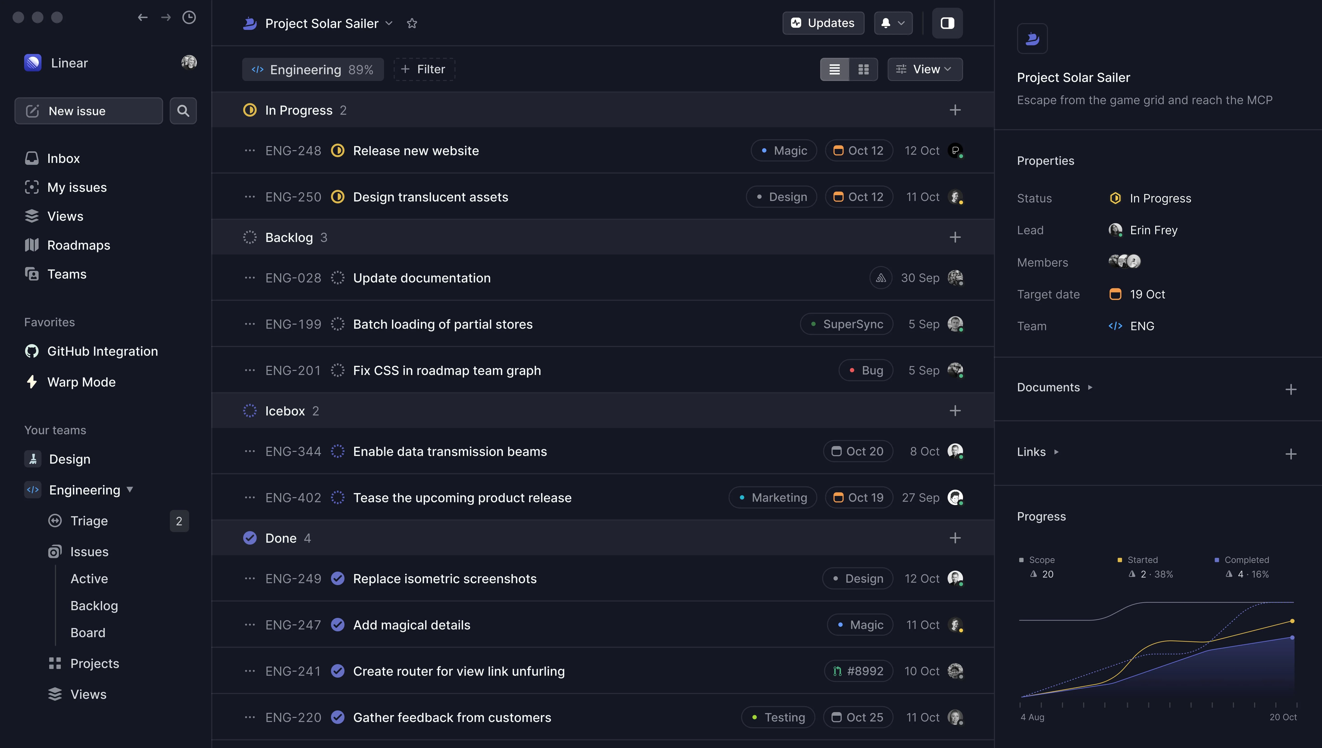
Pure #000 with white text vibrates. I layer neutrals instead: neutral-950 for the page, neutral-900 for cards and neutral-800 for hover and inputs.
Borders and shadows flip
Dark shadows disappear on dark backgrounds. I swap them for a 1px white-alpha ring and a faint top highlight — the same "aceternity" shadow used across this site.
:root { --shadow: 0 2px 3px -1px #0000001a, 0 0 0 1px #191c2114; }
.dark { --shadow: 0 2px 3px -1px #ffffff1a, 0 0 0 1px #ffffff14; }
Keep colour for meaning
Status colours — approved, pending, rejected — stay saturated; everything else stays neutral. When colour only appears where it means something, people scan faster.
Respect the system
Default to the visitor's system theme, remember their choice, and never flash the wrong theme on load. next-themes handles all three.